Long Alt
TL;DR: Keep your image alternative text brief, devoid of special characters, empty of URLs, and ideally in one language.
Here We Go
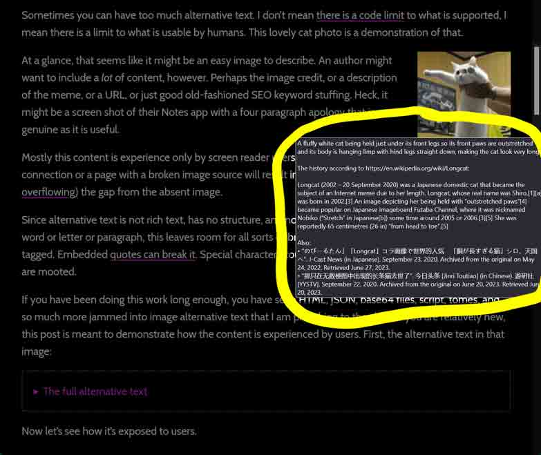
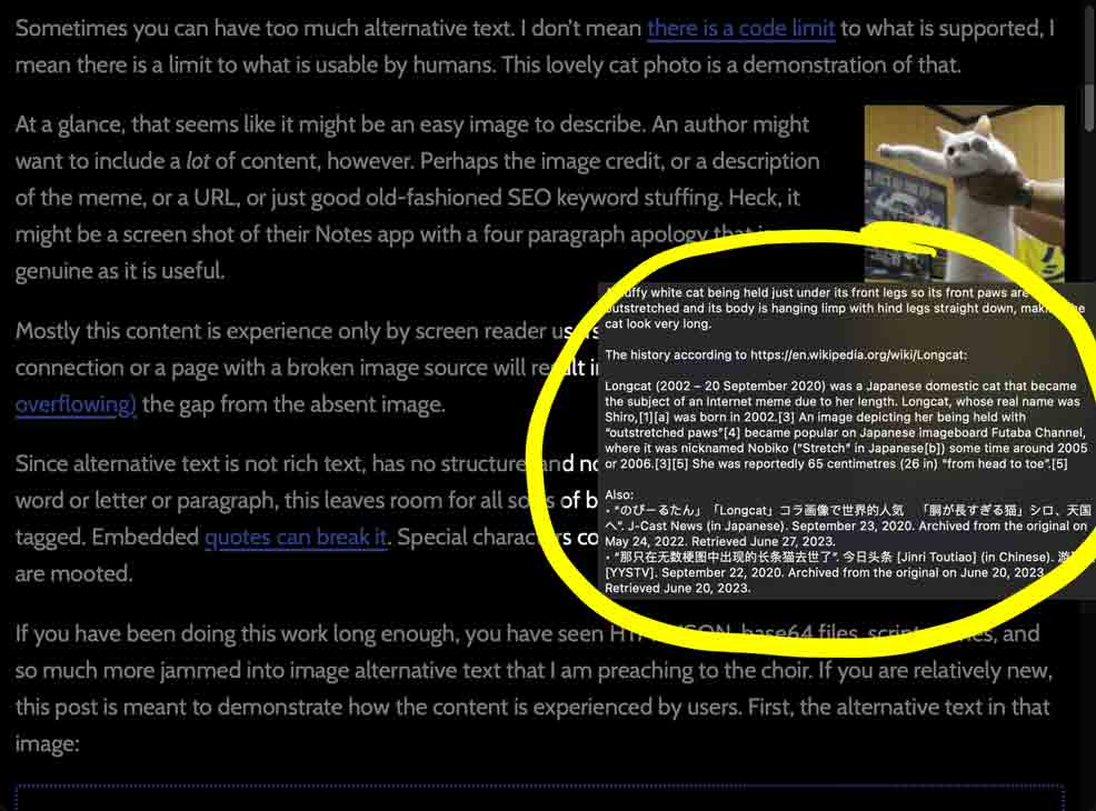
Sometimes you can have too much alternative text, particularly for an <img>. I don’t mean there is a limit to what is allowed, I mean there is a limit to what is usable by humans. This long cat photo demonstrates that.
![A fluffy white cat being held just under its front legs so its front paws are outstretched and its body is hanging limp with hind legs straight down, making the cat look very long.
The history according to https://en.wikipedia.org/wiki/Longcat:
Longcat (2002 – 20 September 2020) was a Japanese domestic cat that became the subject of an Internet meme due to her length. Longcat, whose real name was Shiro,[1][a] was born in 2002.[3] An image depicting her being held with “outstretched paws”[4] became popular on Japanese imageboard Futaba Channel, where it was nicknamed Nobiko (“Stretch” in Japanese[b]) some time around 2005 or 2006.[3][5] She was reportedly 65 centimetres (26 in) “from head to toe”.[5]
Also:
• “のびーるたん」「Longcat」コラ画像で世界的人気 「胴が長すぎる猫」シロ、天国へ”. J-Cast News (in Japanese). September 23, 2020. Archived from the original on May 24, 2022. Retrieved June 27, 2023.
• “那只在无数梗图中出现的长条猫去世了”. 今日头条 [Jinri Toutiao] (in Chinese). 游研社 [YYSTV]. September 22, 2020. Archived from the original on June 20, 2023. Retrieved June 20, 2023.](/wp-content/uploads/2024/04/Longcat.jpg "A fluffy white cat being held just under its front legs so its front paws are outstretched and its body is hanging limp with hind legs straight down, making the cat look very long.
The history according to https://en.wikipedia.org/wiki/Longcat:
Longcat (2002 – 20 September 2020) was a Japanese domestic cat that became the subject of an Internet meme due to her length. Longcat, whose real name was Shiro,[1][a] was born in 2002.[3] An image depicting her being held with “outstretched paws”[4] became popular on Japanese imageboard Futaba Channel, where it was nicknamed Nobiko (“Stretch” in Japanese[b]) some time around 2005 or 2006.[3][5] She was reportedly 65 centimetres (26 in) “from head to toe”.[5]
Also:
• “のびーるたん」「Longcat」コラ画像で世界的人気 「胴が長すぎる猫」シロ、天国へ”. J-Cast News (in Japanese). September 23, 2020. Archived from the original on May 24, 2022. Retrieved June 27, 2023.
• “那只在无数梗图中出现的长条猫去世了”. 今日头条 [Jinri Toutiao] (in Chinese). 游研社 [YYSTV]. September 22, 2020. Archived from the original on June 20, 2023. Retrieved June 20, 2023.")
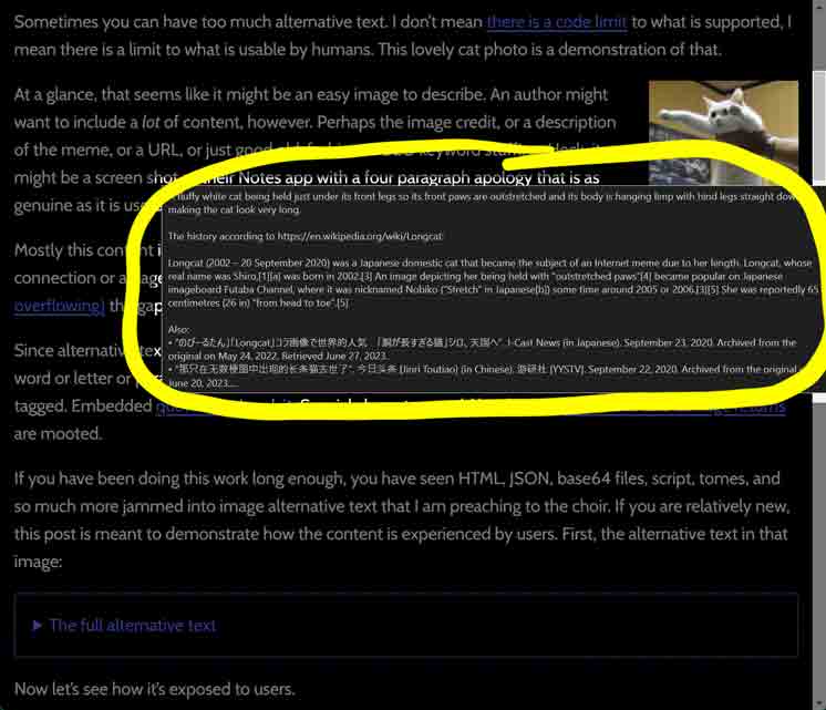
It should be an easy image to describe. An author might want to include a lot of content, however. Perhaps the image credit, or a description of the meme, or a URL, or just good old-fashioned SEO keyword stuffing. Heck, it might be a screen shot of their Notes app with a six paragraph apology that is as genuine as it is useful.
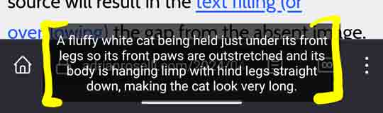
Mostly this content is experienced only by screen reader users, but a user with a poor connection or a page with a broken image source will result in the text filling, overflowing, or being excluded from the gap from the absent image.
Since alternative text is not rich text, it has no structure and no way to navigate by word or letter or paragraph. This leaves room for all sorts of breakage. Text in a foreign language cannot be tagged. Embedded quotes can break it. Special characters (symbols, glyphs in a language other than the page language, etc.) could be skipped. Line feeds and carriage returns are mooted.
If you’ve been doing this work long enough, you’ve seen HTML, JSON, base64 files, script, tomes, and so much more jammed into image alternative text. If you are relatively new, this post is meant to demonstrate how the content is experienced by users.
First, the alternative text in that image:
The full alternative text
A fluffy white cat being held just under its front legs so its front paws are outstretched and its body is hanging limp with hind legs straight down, making the cat look very long.
The history according to https://en.wikipedia.org/wiki/Longcat:
Longcat (2002 – 20 September 2020) was a Japanese domestic cat that became the subject of an Internet meme due to her length. Longcat, whose real name was Shiro,[1][a] was born in 2002.[3] An image depicting her being held with “outstretched paws”[4] became popular on Japanese imageboard Futaba Channel, where it was nicknamed Nobiko (“Stretch” in Japanese[b]) some time around 2005 or 2006.[3][5] She was reportedly 65 centimetres (26 in) “from head to toe”.[5]
Also:
• “のびーるたん」「Longcat」コラ画像で世界的人気 「胴が長すぎる猫」シロ、天国へ”. J-Cast News (in Japanese). September 23, 2020. Archived from the original on May 24, 2022. Retrieved June 27, 2023.
• “那只在无数梗图中出现的长条猫去世了”. 今日头条 [Jinri Toutiao] (in Chinese). 游研社 [YYSTV]. September 22, 2020. Archived from the original on June 20, 2023. Retrieved June 20, 2023.
Now let’s see how it’s exposed to users.
As a Broken Image
I took screen shots of this post while drafting it. Two shots for each browser, one with width and height attributes (which also defines an aspect ratio) and one without.
On this site, I give my images an italic text style to make their alternative text a bit more obvious:
img {
  font-style: italic;
}
For images that are aligned to the right (in sufficiently wide viewports), I set their maximum width to 49%. This is why the text alternative does not fill the window from edge to edge in my screen shots:
img.left, img.right {
  max-width: 49%;
  height: auto;
}
In the following screen shots, I darkened the surrounding text and circled the missing images in yellow to make them more obvious.
Firefox
Chrome
Safari
Via a Screen Reader
My plan was to record this with NVDA, JAWS, VoiceOver, Narrator, and Orca on desktop and then wander over to VoiceOver and TalkBack on mobile. But then I spent hours making the NVDA video and decided I could just tell you what’s different with the others. It’s not like you’re paying me for this.
This is by no means exhaustive.
Read-All
NVDA breaks the alternative text based on line feeds and length of chunks of text, announcing the word “graphic” before each. For a blind screen reader user, they may not immediately understand that they are hearing a single image versus 16. Notice also how the Japanese & Chinese characters are skipped and how verbose URLs and symbols are.
JAWS with Chrome differs by not announcing “graphic”.
VoiceOver with Safari also does not announce “graphic” but it does announce the Japanese and Chinese words. VoiceOver also ignores most symbols.
Narrator with Edge does not announce “graphic” and ignores most symbols. Annoyingly, it also announces the value of the title, prepended with “graphic”.
VoiceOver on iPadOS matches VoiceOver on macOS. Though for some reason when reaching the end of the image VO also speaks CS ALL-TINE TOP THA
.
TalkBack when used with either Firefox or Chrome announce the full alternative text, including the Japanese & Chinese text. When paired with Firefox, TalkBack breaks it up a bit with the on-screen captions, but with Chrome it’s all one block. TalkBack also concatenates the alt text and the title, stuffing the word “graphic” between them. Finally, they both announce “https://” as https: 2 Slashen
. Which is a vibe.
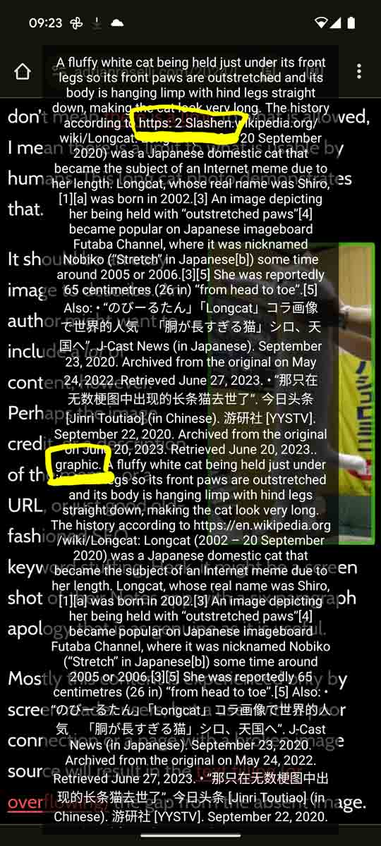
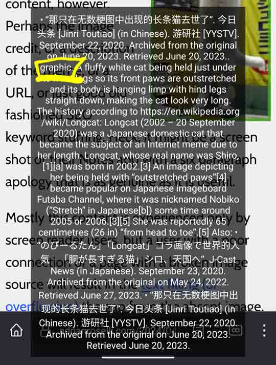
title attribute is announced directly after the alt, with only the word “graphic” as a cue. I also highlighted the https: 2 Slashenand show how TalkBack with Firefox breaks up the alt text.
Virtual Cursor
Because NVDA breaks the alternative text into chunks, it takes 16 ↓ key presses to get through this example. Notably, a user can work their way backward through these chunks, which I demonstrate at the end of the video with the final four ↑ key presses (from 1:34 forward).
JAWS with Chrome differs in one key way — one press of the arrow key is all it takes. The drawback is that you cannot go backward through chunks of the alternative text, so if you miss something on the first pass you have to start over.
VoiceOver does not read the alternative text for the image unless I press the finger-mangling Ctrl + Option + Shift + ↓ combo (you could just press →, but VoiceOver instructs you to do digital gymnastics). VoiceOver also does not allow you to work your way backward through the alternative text.
Narrator with Edge behaves as it does with read-all, including its decision to roll right into announcing the value of the title attribute.
VoiceOver on iPadOS matches VoiceOver on macOS. Including the curious end-of-image flourish.
TalkBack when used with either Firefox or Chrome behaves as it does when using read-all.
By Image
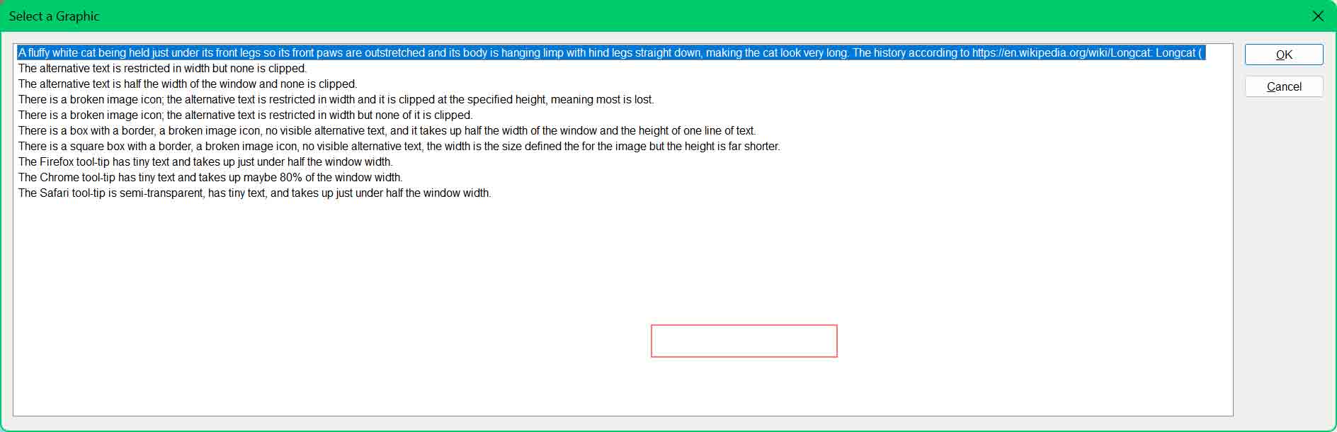
I’ll spare you (me) a video or even a detailed description and drop this JAWS image dialog here to show you how it is distended from this absurd alternative text.
TalkBack on Android does not allow navigation by image. The remaining screen readers treat it as if navigated by virtual cursor.
Ugh title
The title attribute is an annoyance in many cases. The browser treats it as an accessible description (presuming there is alternative text), which can make for a more verbose screen reader experience. I am including it in this post for completeness. Don’t use it.
Touch and voice users generally do not benefit from it, given the resultant tool-tip appears on hover (IE and pre-Chromium Edge did it on keyboard focus).
A title can also block content behind the tool-tip. I have sat in on user studies where the user’s mouse cursor was just hanging out in the viewport, and the giant tool-tip blocked content for them. These users did not have the ability to easily move that cursor, so they had to scroll up and down to see the blocked content.
Wrap-up
Keep your image alternative text brief, devoid of special characters, empty of URLs, and ideally in one language.
Alternative text is no place for SEO nonsense, editorializing, URLs, image credit, or more than maybe a sentence (certainly not the thousand words images may be worth). Anyone arguing for more should try using it with a screen reader (maybe with a bonus task to follow the embedded URL or copy an embedded name) or images disabled.
Social media is no excuse to ignore this advice.
This post does not guide you on what to write, only what not to write. There are many good articles and posts out there already on crafting useful alternative text. I re-created the W3C alt text decision tree as a post on this site if don’t want to go elsewhere.
Related on This Site
- The Writing Alternative Text section from Improving Your Tweet Accessibility, 6 January 2018
- Accessible Memes Can Be Done, 24 April 2018
- Blaming Screen Readers 🚩×5, 16 October 2021
- Reference: SRs and Extended Characters, 19 October 2021
6 Comments
I suspect that “CS ALL-TINE TOP THA” is VoiceOver attempting to read the text on the car poster in the background of the image via image recognition. The poster appears to read “…M ITC’S ALL-TIME TOP TEAM”
In response to . Ayup, good catch. I had “Text Recognition” enabled in the VO settings. I assume I forgot to disable that from prior testing. When I disabled it the extra announcement went away. Thanks!
VoiceOver’s curious “CS ALL-TINE TOP THA” is likely an attempt to identify the text present in the image (“ITC’S ALL-TIME TOP TEAM” from the poster on the left wall). That approach is sort of understandable if there was no alt present, but it’s a strange choice when an explicit description has already been provided by the author.
this is an excellent breakdown, thanks. Hope springs eternal that it will help convince some of those well-meaning social media users who believe that posting an entire novel in the alt is helpful.
If one *does* have a lot more legitimate and relevant things to say about an image, can it be put in an aria-describedby element? And if that is the case, should the alt attribute be left empty? Thanks for all of your writings. They are clear and informative.
In response to . If you set
alt=""in your image, then it will be skipped by a screen reader, including its accessible description. However, not all screen reader and browser combinations readaria-describedbyfor an image anyway, so you cannot rely on it regardless.Provide longer descriptions as text in the page. Stuff it in a disclosure widget if you think it takes up too much space. In that scenario, generally don’t set
alt=""either since then your description will make no sense to a screen reader user. My 2015 post Use On-Page Image Descriptions is scarily just as relevant today.
Leave a Comment or Response