My Gratuitously Signaling Watch
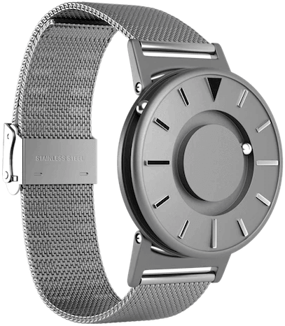
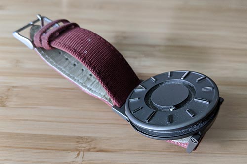
In early 2016 I bought myself the Eone Bradley (nobody is sponsoring this post and the link is not an affiliate link). I first saw this watch at the CSUN Assistive Technology Conference, some on the wrists of people with little or no vision, and had admired it since then.
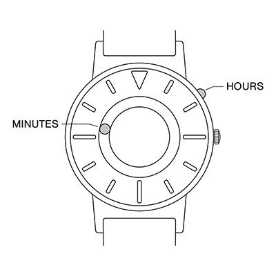
It has a unique method of telling time. You can look at the face of the watch or you can feel the position of the ball bearing hands. For many blind users this watch is a much better option than a Braille watch, which I understand are prone to breaking. This also means they do not need to rely on a smart watch as the only other viable alternative.
You might wonder why I was interested in it (and could justify expensing it to my own LLC) given that I am not blind. As a consultant who focuses on digital accessibility, this watch has proven to be a useful artifact for my work.
Often I am faced with clients who argue that designing for accessibility is limiting, that accessibility equals ugly. I can point to this watch and, even if the client may not personally find it attractive, demonstrate that making something accessible does not guarantee ugly. Designers work within constraints, and the watch is an example of a constraint that did not limit the designer.
For face-to-face meetings with clients, it is important to keep track of the time. Managing the clock is part of most engagements (for budgets, for giving each topic enough time, for getting to the next event, and so on). Furtive glances at your watch can send the wrong message to your client. You don’t want to appear restless or fidgety, counting down to your escape; you want to be focused. Being able to read the time without looking away makes it easier to maintain your presence — at least as far as the client is concerned.
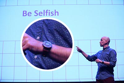
The watch also becomes an ice breaker or conversation starter. When I conduct training, speak at conferences, or randomly flail my arms about, people regularly approach me to ask about the watch. That is an opportunity to explain it, demonstrate it, and pitch the concepts of accessibility, universal design, and even my own business card. Also, yes, people still take business cards (no idea what they do with them).

Finally, it is a bit of a signal in the digital accessibility community. At a conference or a client, if someone is working in or adjacent to accessibility they have a greater chance of knowing about the watch. It lets them know they aren’t alone out there pushing accessibility. We may not be legion, but we are present.
There are a few other features that are not worth promoting. The canvas bands produce handy strings that always contrast with your shirts, the ball bearing tracks trap more lint than my navel, and the watch burns through batteries at probably double the rate of other watches.
It is not inexpensive, but as the entirety of my (non-conference-sponsorship) marketing budget I think it was worth the one-time cost. Oh, and the ongoing battery cost.
Leave a Comment or Response